Oxford School of English
Oxford School of English
2023
2023
Visual Identity, Branding.
Independent Rebrand for a Private English School Based in Oxford, UK.
Visual Identity, Branding.
Independent Rebrand for a Private English School Based in Oxford, UK.
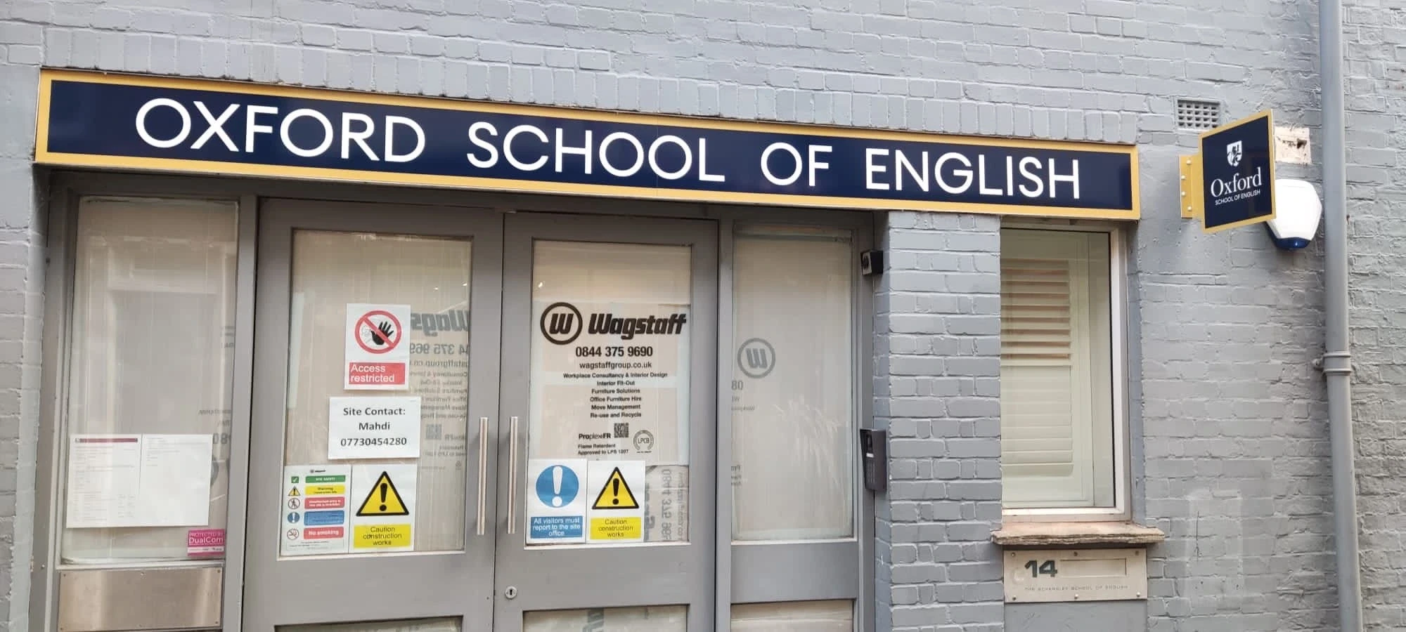
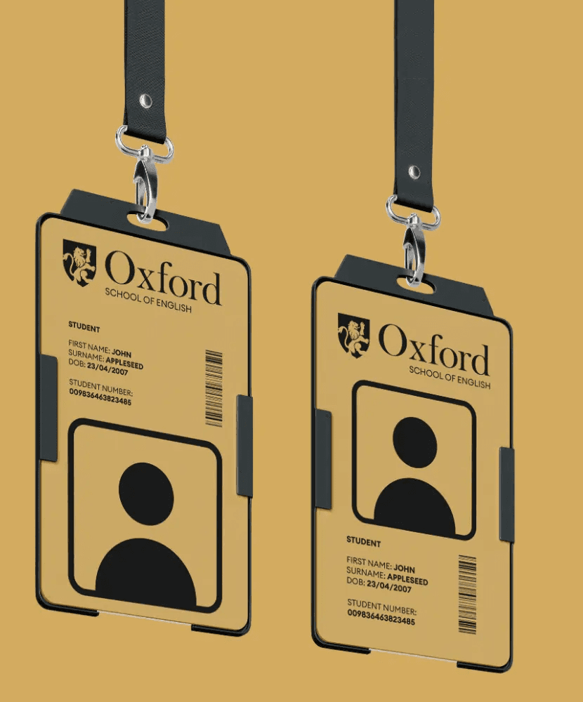
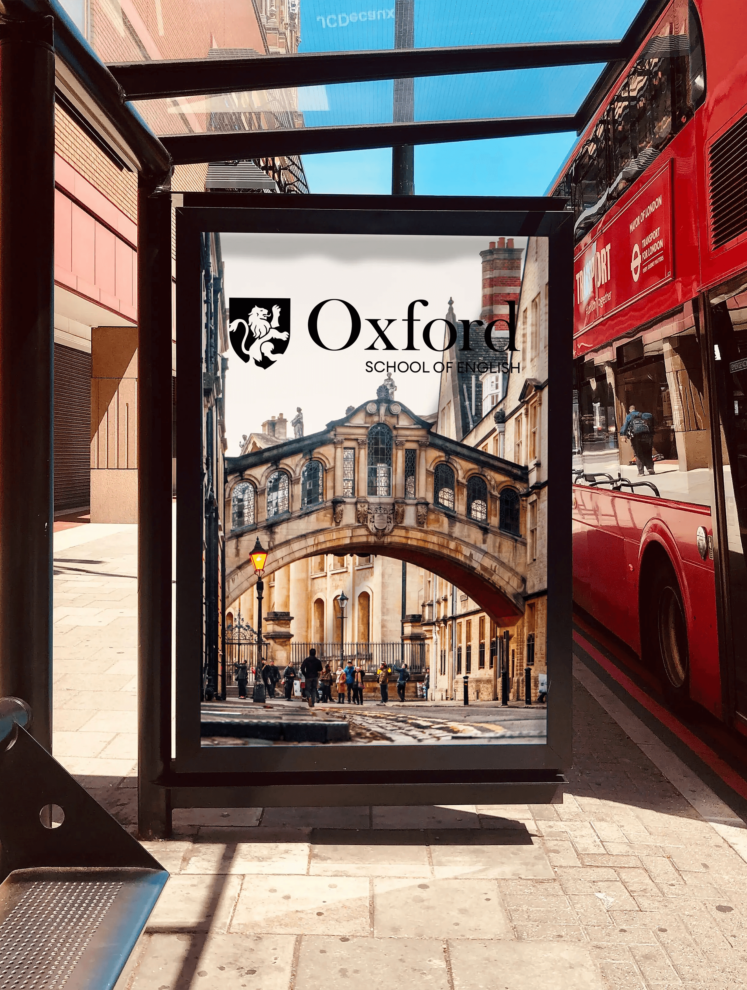
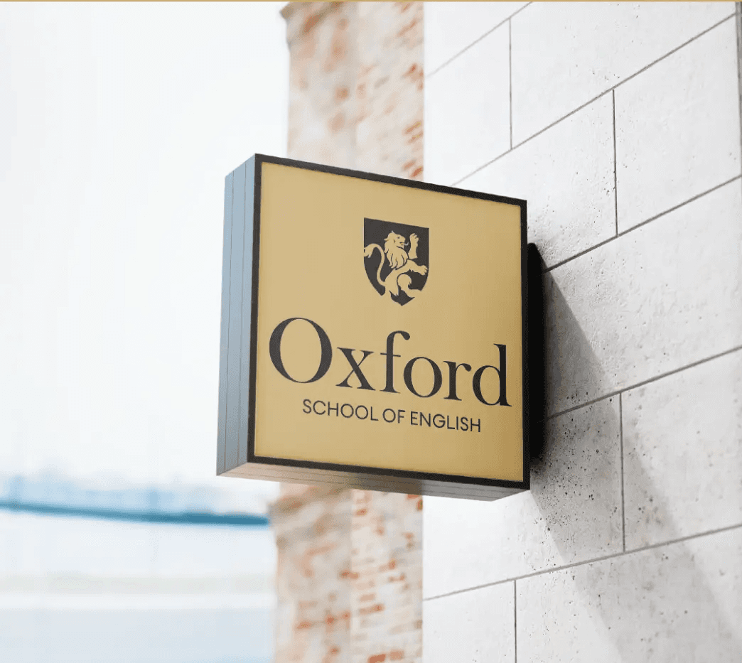
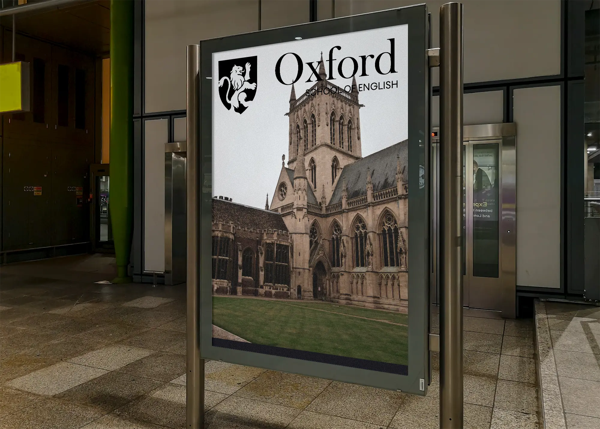
I was personally tasked with redesigning the Oxford School of English's visual identity to reflect a modern yet prestigious image, while preserving the school’s historic roots to gain more traction from international students.
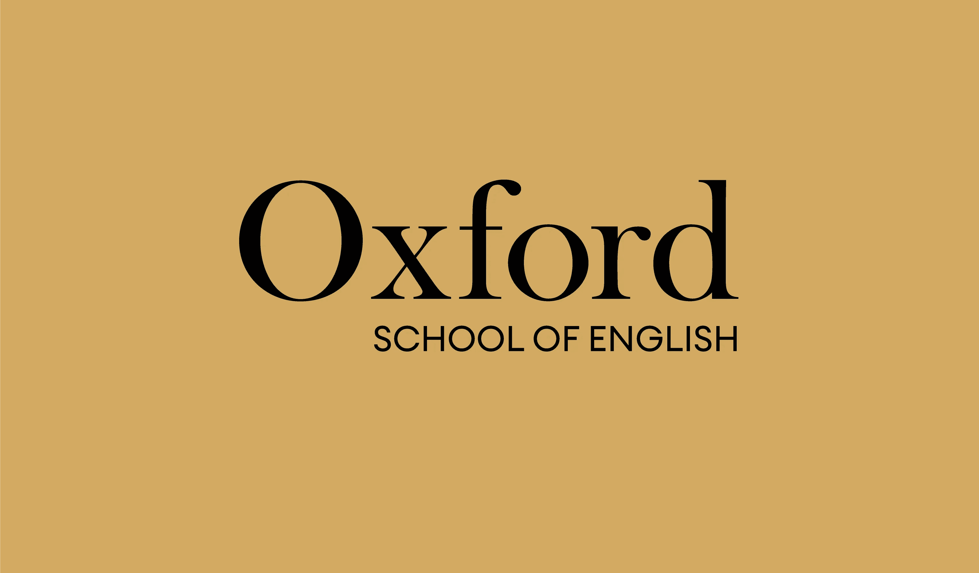
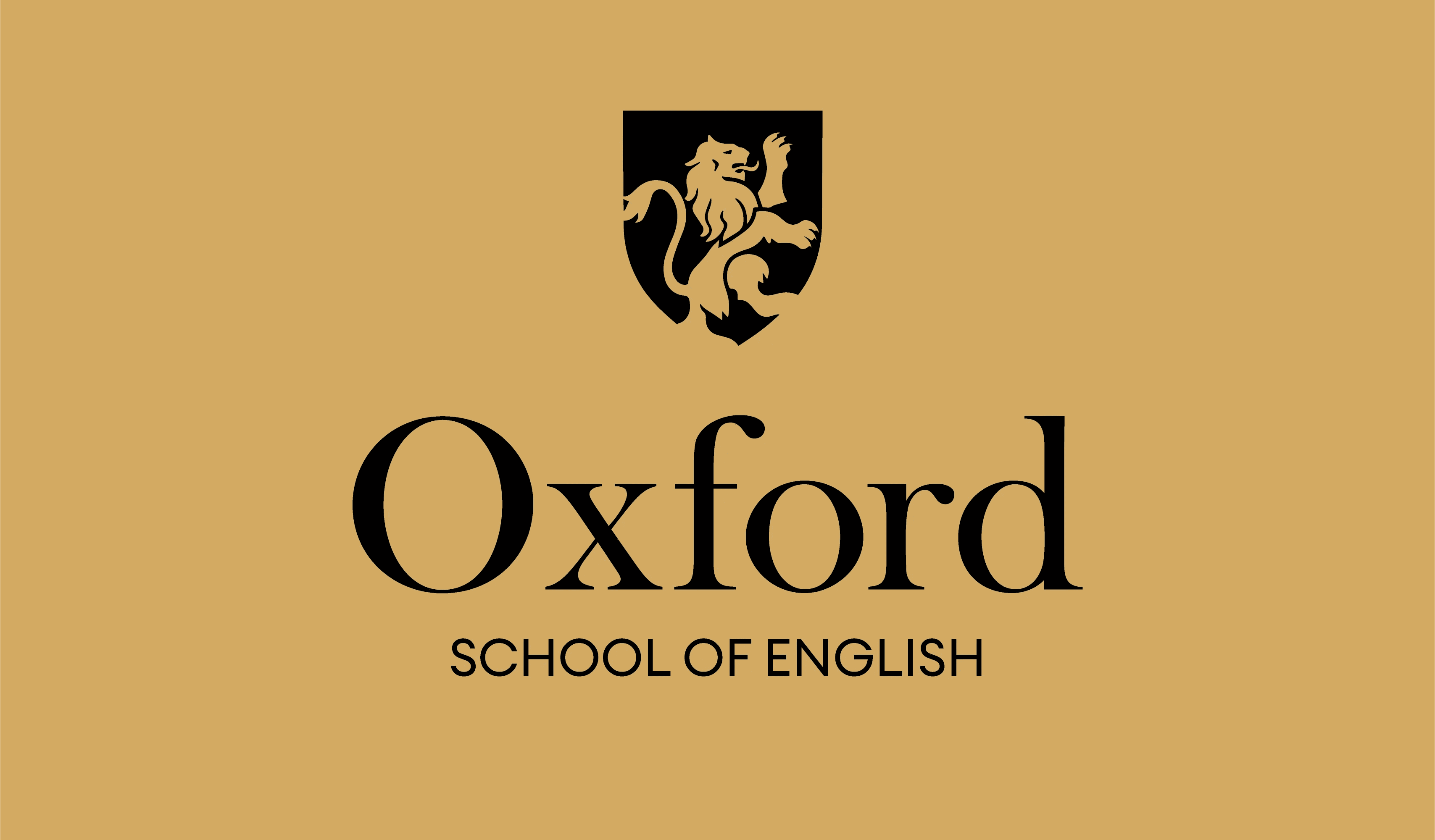
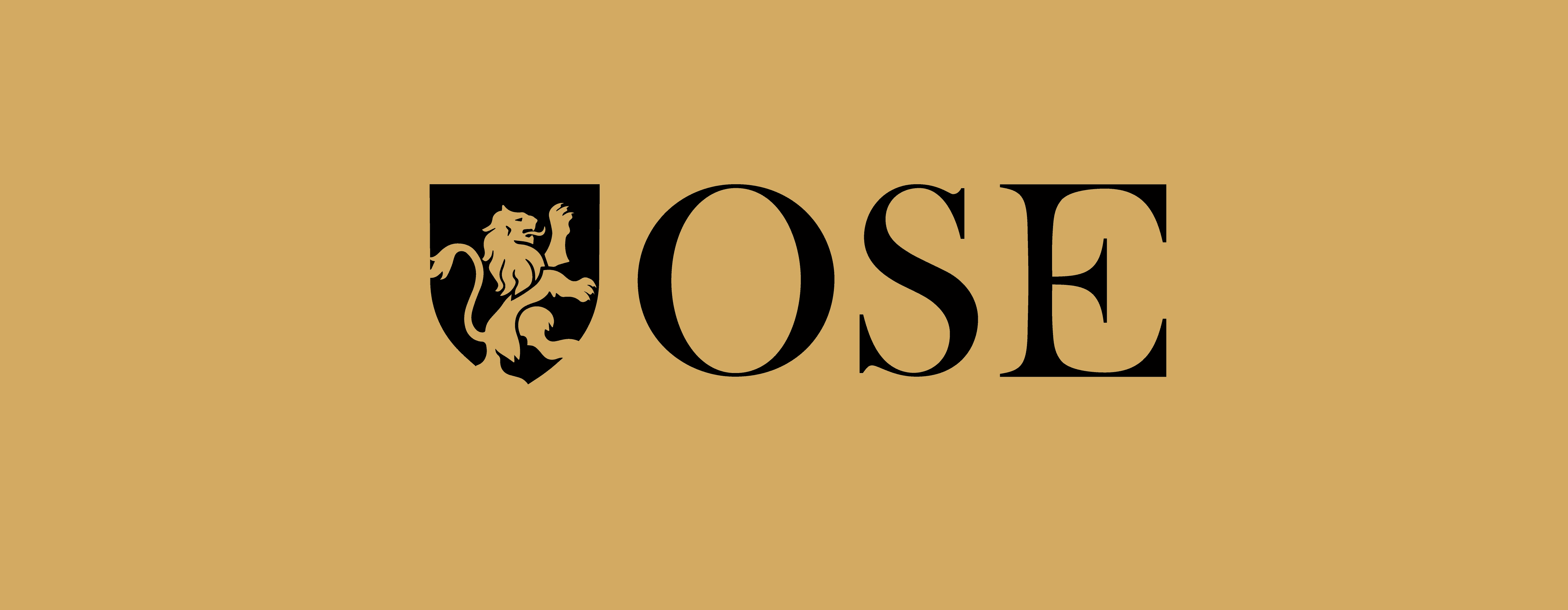
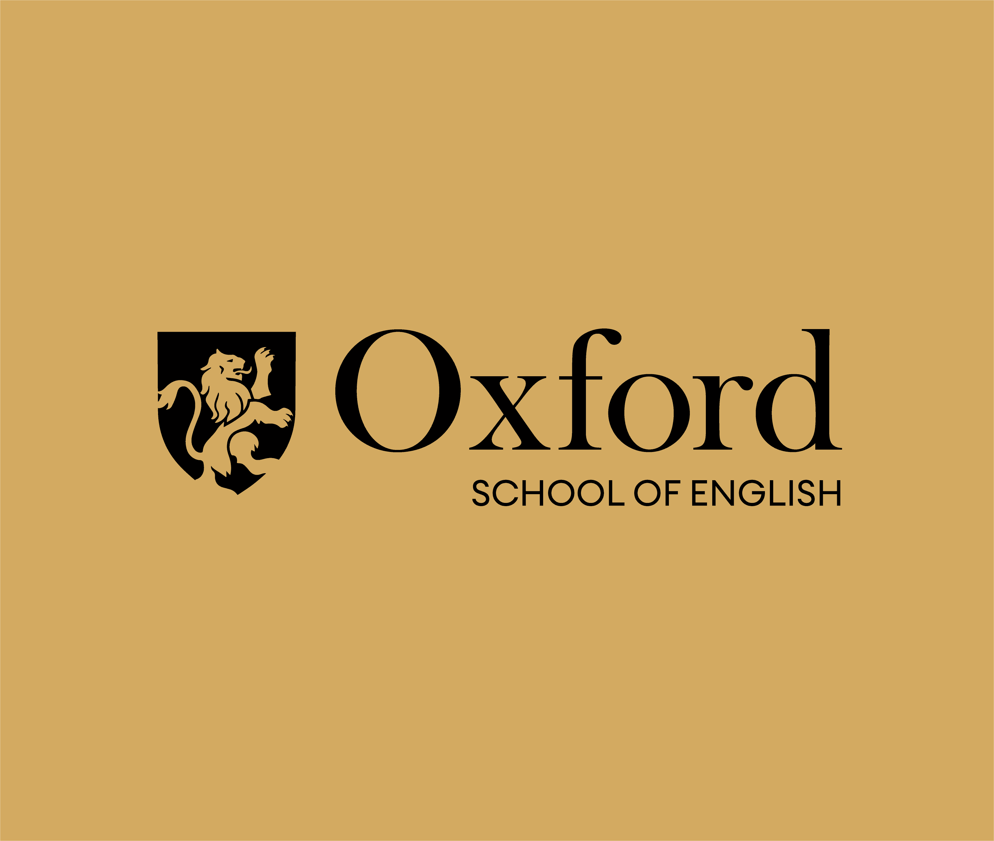
The old logo lacked structure and relevance for an international market, while also being a copy of the Oxford Dictionary Logo. My approach incorporated the English lion, symbolizing British heritage, within a shield to evoke the traditional English crest. This not only nods to historic symbols like those of the England FA, but also taps into global cultural references, such as the iconic crests from Harry Potter films.
The colour palette, featuring “Oxford Gold” and “Oxford White,” was inspired by the city’s architecture to create a high-end aesthetic. The typography blends classic and modern elements to reinforce the school's prestigious image. From logo creation to typography and colour choices, this solo project completely redefined OSE’s identity, preparing it to engage a global market.
I was personally tasked with redesigning the Oxford School of English's visual identity to reflect a modern yet prestigious image, while preserving the school’s historic roots to gain more traction from international students.
The old logo lacked structure and relevance for an international market, while also being a copy of the Oxford Dictionary Logo. My approach incorporated the English lion, symbolizing British heritage, within a shield to evoke the traditional English crest. This not only nods to historic symbols like those of the England FA, but also taps into global cultural references, such as the iconic crests from Harry Potter films.
The colour palette, featuring “Oxford Gold” and “Oxford White,” was inspired by the city’s architecture to create a high-end aesthetic. The typography blends classic and modern elements to reinforce the school's prestigious image. From logo creation to typography and colour choices, this solo project completely redefined OSE’s identity, preparing it to engage a global market.